ClearDark-Plus
ClearDark+ v2
V2 has Arrived! The Translucent Dark Glass Theme You’ve Been Waiting For!
New version : ClearDark+ v2.0.1
Discord gets a sleek, luminous upgrade with the Translucent Dark Glass V2! It’s clear, dark, and full of life, creating a modern and cheerful space for all your chats.
- Check out the changelog : Changelog v2.0.1
CSS link
The updated source code main.css :
https://fo-lighty.github.io/ClearDark-Plus/css/main.css
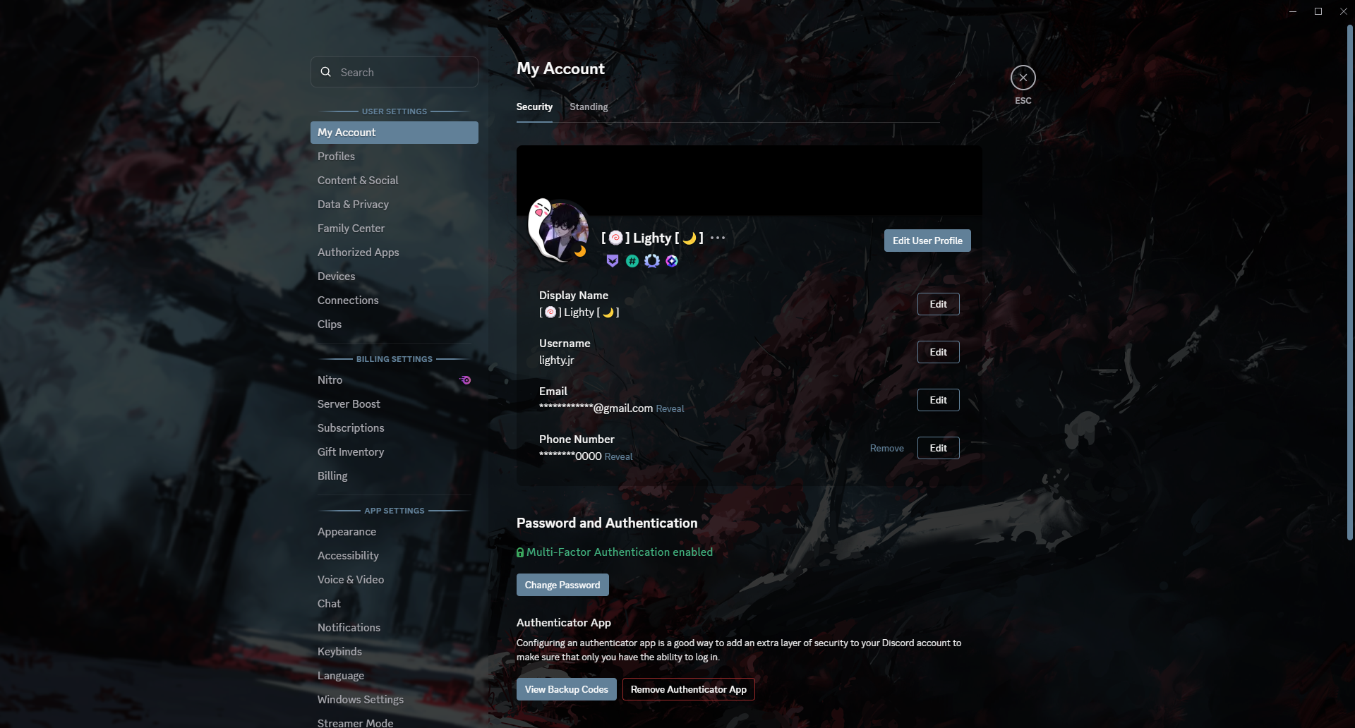
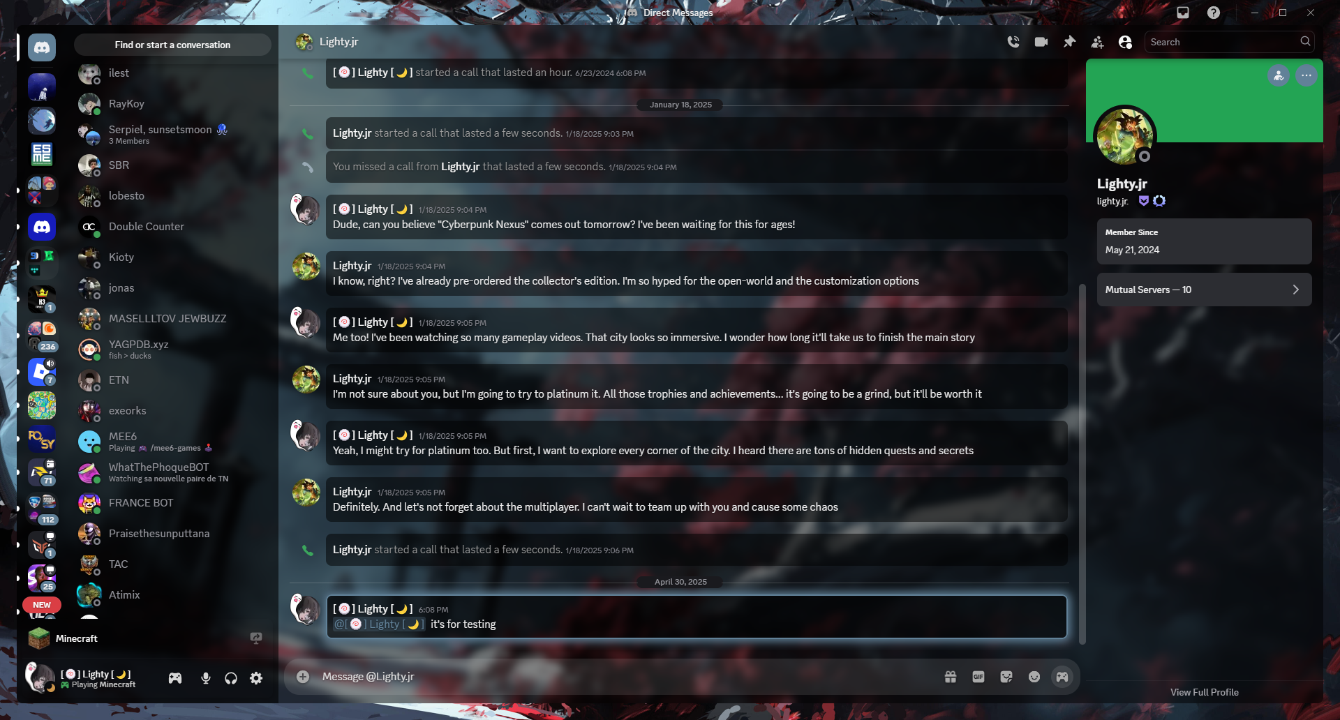
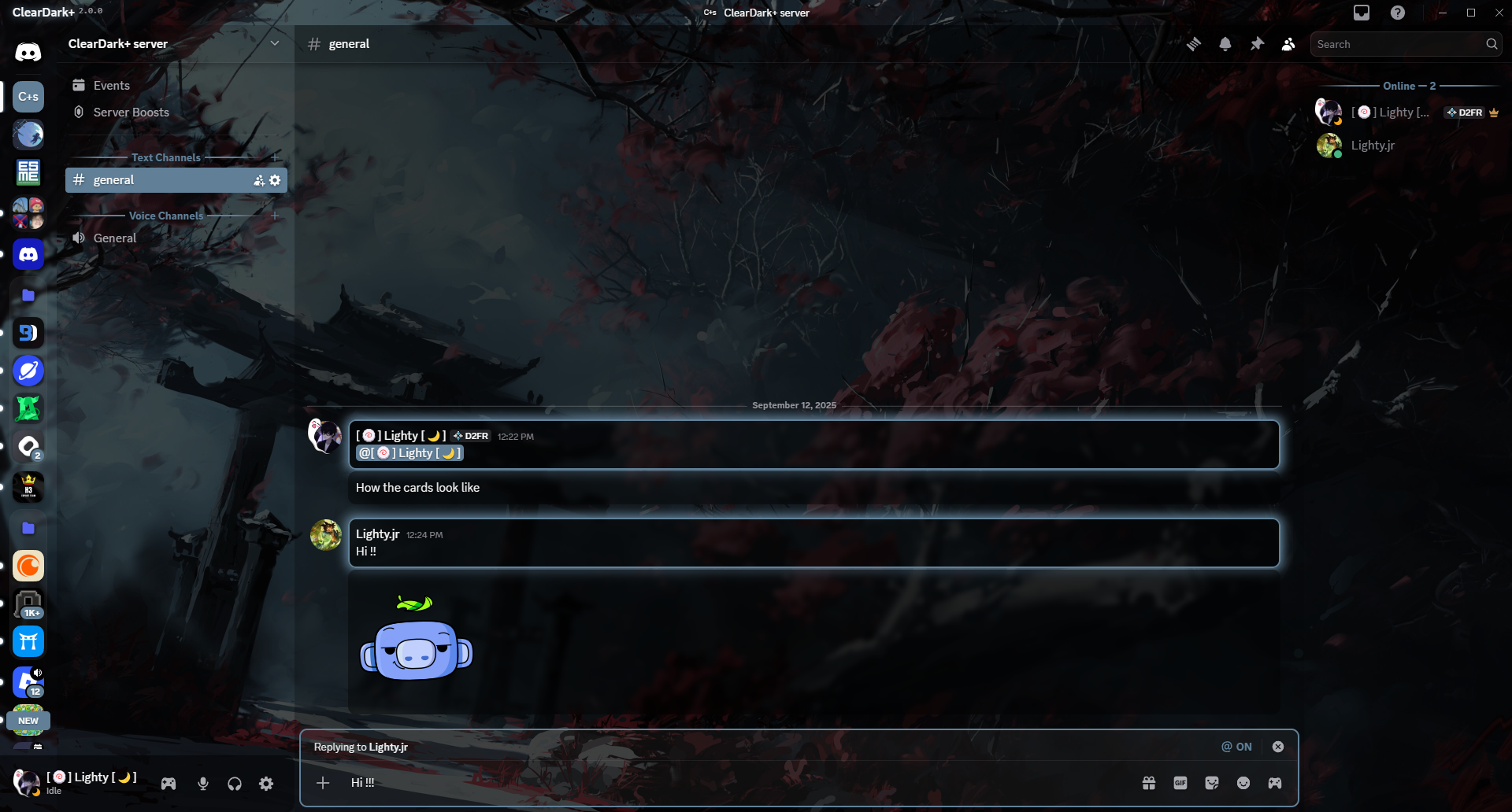
Preview
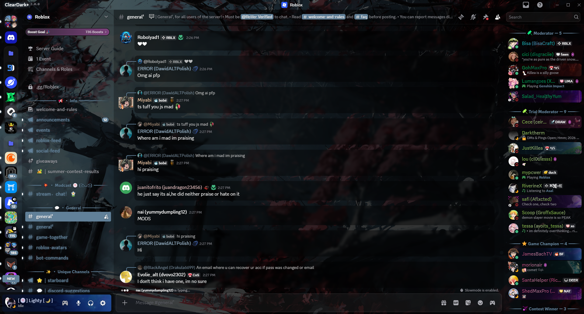
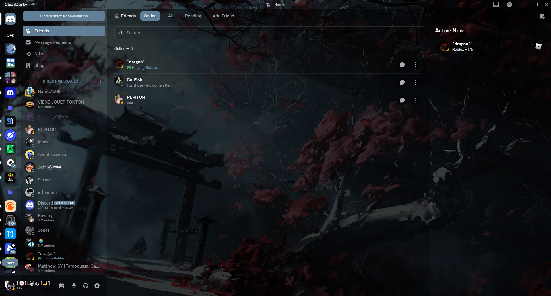
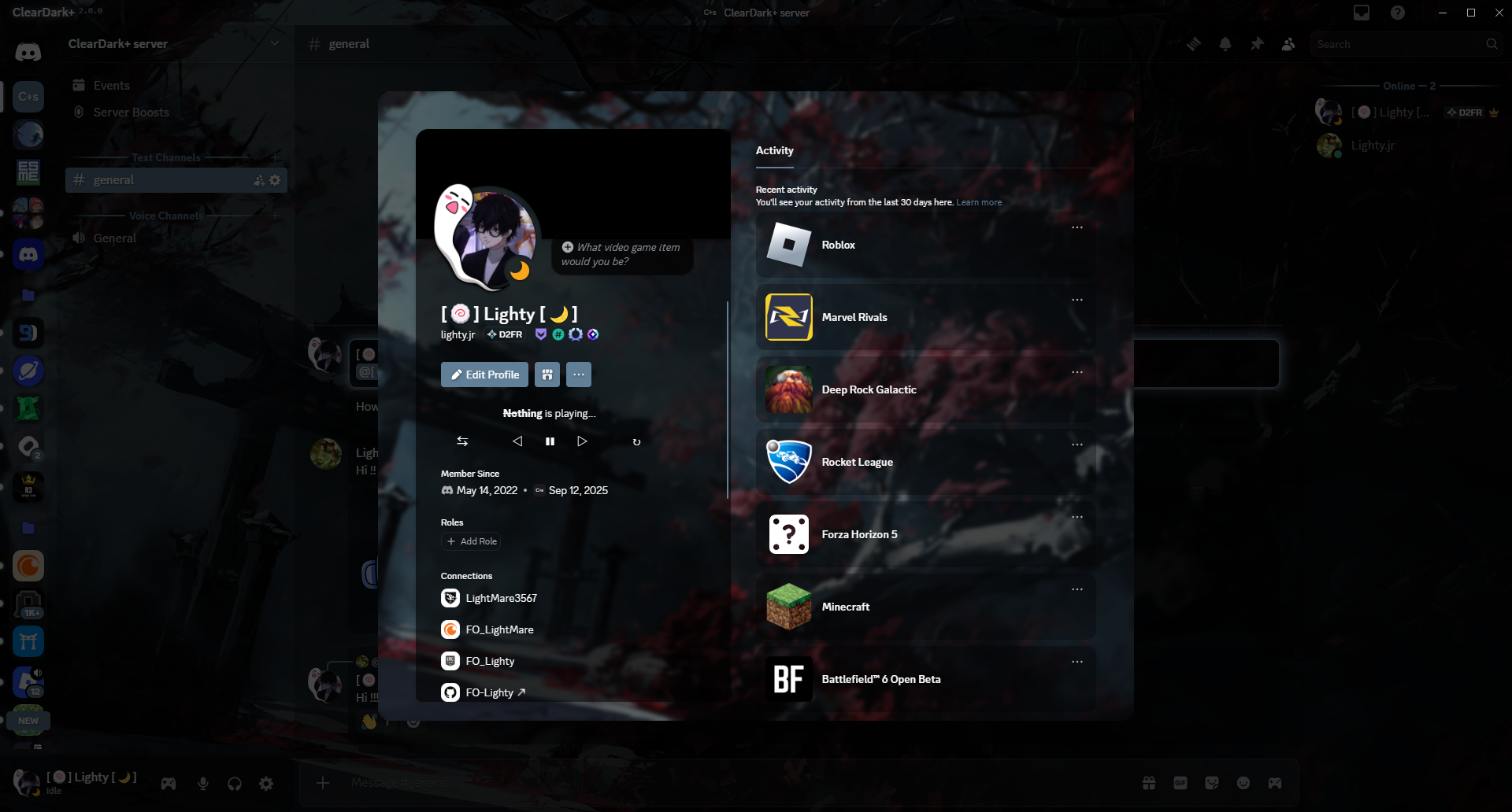
Take a peek at these previews of the theme! These images will give you a glimpse into its unique style:
Main chat area
User’s friends
User server info
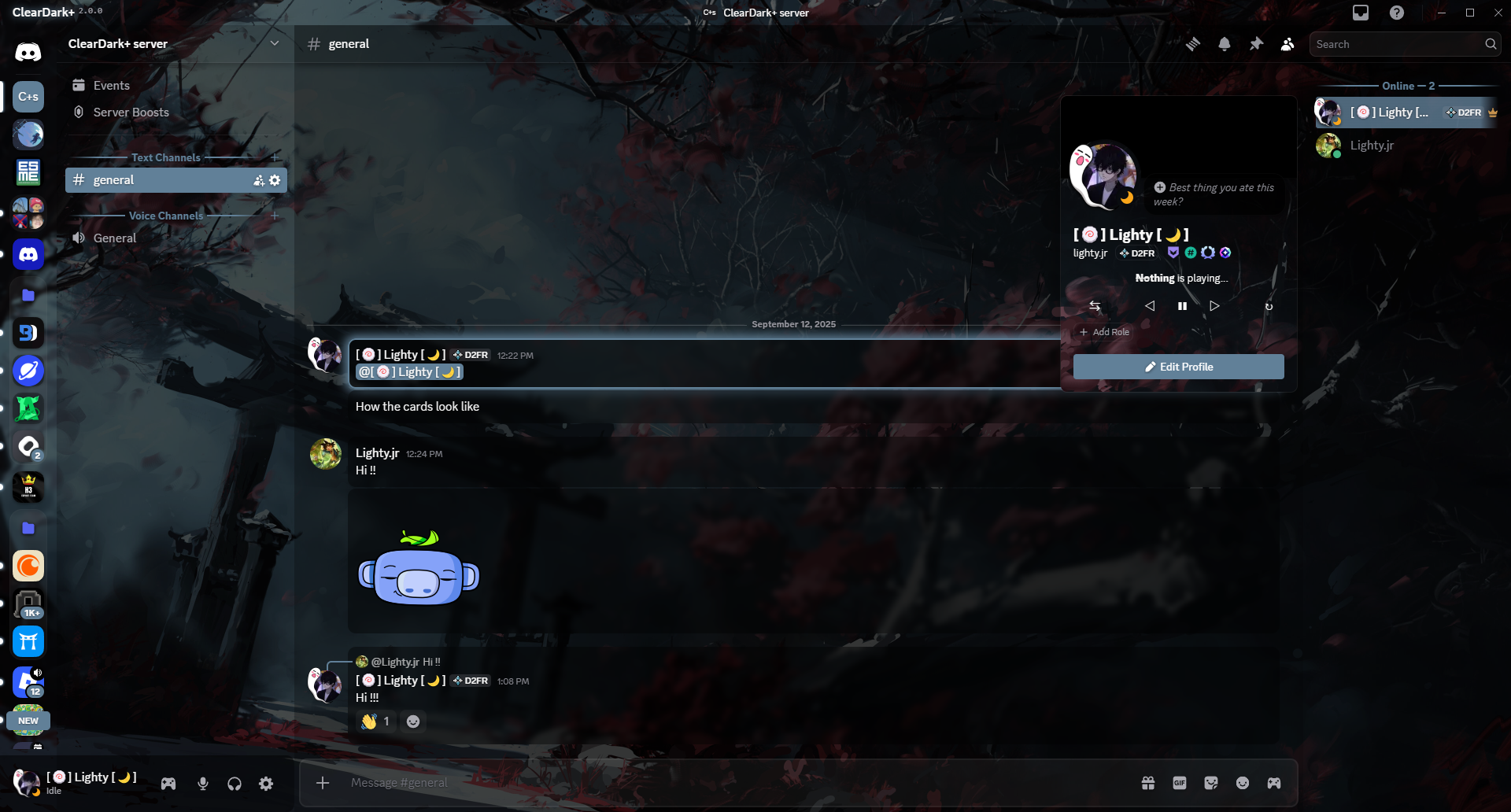
User info popout
User settings
DMs
Cards
About
I created this theme to share my knowledge and skills with everyone.
Accessible, practical, and customizable are my guiding principles for this V2 of the project. A contrast adaptation has been made to meet the needs of some users (yes, I did this for you, those who use Discord’s light theme).
Installation
Installation of BetterDiscord :
- Download the installer on the official website (https://betterdiscord.app)
- Open the installer (BetterDiscord.exe)
- Follow the instruction and done!
Installing betterdiscord themes is really easy!
- Go into discord’s settings
- Go to “Themes”
- Click on “Open theme folder”
- Move the
.theme.cssfile you downloaded into the folder you just opened - Click the checkbox in the top-right corner of the theme in discord to enable it
Variables
Accent Colors
--main-color- The main accent color (hex, rgb or hsl). Default:#618098--hover-color- The hover accent color (hex, rgb or hsl). Default:#8199ad--success-color- The positive accent color (hex, rgb or hsl). Default:#43b581--danger-color- The danger accent color (hex, rgb or hsl). Default:#982929--accent-text-color- The accent text color (hex, rgb or hsl). Default:hsl(216,17%,94%)
Status Colors
--online-color- The online status color (hex, rgb or hsl). Default:#43b581--idle-color- The idle status color (hex, rgb or hsl). Default:#faa61a--dnd-color- The Do Not Disturb status color (hex, rgb or hsl). Default:#982929--streaming-color- The streaming status color (hex, rgb or hsl). Default:#593695--offline-color- The offline/invisible status color (hex, rgb or hsl). Default:#808080
App Background
--background-shading-percent- The app background shading amount (0 for complete smoothness). Default:100%--background-image- The app background image (link must be HTTPS). Default:url(https://fo-lighty.github.io/ClearDark-Plus/assets/images/Samurai.jpeg)--background-position- The app background position. Default:center--background-size- The app background size (px). Default:cover--background-attachment- The app background attachment. Default:fixed--background-filter- The app background adjustments (ex: blur, saturation, brightness). Default:saturate(calc(var(--saturation-factor, 1) * 1))--background-modifier-hover- The background modifier for hover effects. Default:hsl(0,0%,100%,0.075)--background-modifier-active- The background modifier for active effects. Default:hsl(0,0%,100%,0.1)--background-modifier-selected- The background modifier for selected elements. Default:hsl(0,0%,100%,0.125)--background-modifier-accent- The background modifier for accent elements. Default:hsl(0,0%,100%,0.175)
User Popout Background
--user-popout-image- The user popout background image (link must be HTTPS) (not applied to nitro users). Default:var(--background-image)--user-popout-position- The user popout position. Default:var(--background-position)--user-popout-size- The user popout size (px). Default:var(--background-size)--user-popout-attachment- The user popout background attachment. Default:var(--background-attachment)--user-popout-filter- The user popout background adjustments (ex: blur, saturation, brightness). Default:var(--background-filter)
Reply HSL Color Settings
--reply-accent- The reply accent color (hex, rgb or hsl). Default:#738292
Card Settings
--card-color- The background color of the cards. Default:hsl(0,0%,0%,0.4)--card-color-hover- The background color of the cards when hovered. Default:hsl(0,0%,0%,0.5)--card-color-select- The background color of the cards when selected. Default:hsl(0,0%,0%,0.625)--card-radius- The border radius of the cards. Default:10px--card-header-shadow- The box-shadow for the card header. Default:0px 3px 9px 0px hsl(0,0%,0%,0.25)
Mention HSL Color Settings
--mention-color- The mention color. Default:var(--main-color)--mention-opacity- The opacity of the mention color. Default:1
Message Color Settings
--message-color- The background color of a message. Default:hsl(0,0%,0%,0.4)--message-color-hover- The background color of a message when hovered. Default:hsl(0,0%,0%,0.55)--message-radius- The border-radius of the messages. Default:10px--message-padding-top- The top padding of the messages. Default:8px--message-padding-side- The side padding of the messages. Default:8px
User Modal Background
--user-modal-image- The user modal background image (link must be HTTPS) (not applied to Nitro users). Default:var(--background-image)--user-modal-position- The user modal position. Default:var(--background-position)--user-modal-size- The user modal size (px). Default:var(--background-size)--user-modal-attachment- The user modal background attachment. Default:var(--background-attachment)--user-modal-filter- The user modal background adjustments (ex: blur, saturation, brightness). Default:var(--background-filter)
Home Icon
--home-icon- The home button icon (link must be HTTPS). Default:url(https://fo-lighty.github.io/ClearDark-Plus/assets/icons/discord.svg)--home-size- The home button icon size (px). Default:cover
Fonts
--main-font- The main font for the app (font must be installed). Default:"gg sans", "Helvetica Neue", Helvetica, Arial, sans-serif--code-font- The font for codeblocks (font must be installed). Default:Consolas, "gg mono", "Liberation Mono", Menlo, Courier, monospace
Channel Colors
--channel-normal- The channel text color. Default:var(--interactive-normal)--channel-muted- The muted channel text color. Default:var(--interactive-muted)--channel-hover- The hovered channel text color. Default:var(--interactive-hover)--channel-selected- The selected channel text color. Default:var(--interactive-active)--channel-selected-bg- The selected channel background. Default:var(--main-color)--channel-unread- The unread channel text color. Default:var(--main-color)--channel-unread-hover- The unread channel hover color. Default:var(--hover-color)
Accessibility
--focus-color- The outline when pressing the TAB key. Default:var(--main-color)